Building Modular and Flexible React Container Components
This article shows you how to correctly build React components, especially container components in a modular and flexible way such that they can be used with customization across apps and use cases without having to modify the component code.
While React makes it very simple to create composable components, providing flexibility for varying use cases by apps consuming the components requires care in consuming only properties explicitly supported and passing on the remaining ones to the underlying DOM elements. In this article, we will explore best practices integrated from multiple sources to achieve this goal.
All code for this article is available on Github
Motivation
I learned many of these techniques while trying to wrap Material Components for Web into re-usable React components. The project is called reactmdcweb hosted on Github.
Expected Outcome
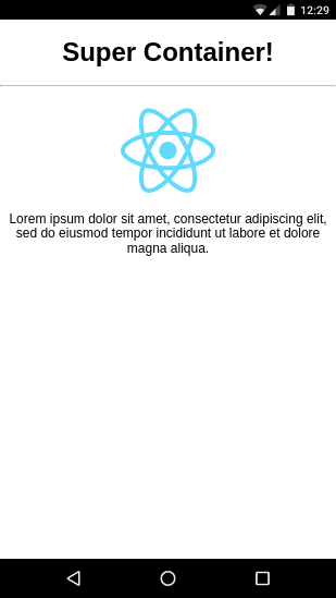
We will build a container component like the picture below. It is a colored box that spans the available width and contains children that will have left-aligned text. The parent must specify a title which is center aligned. The component will be flexible and modular allowing event binding & style overrides by the app using the component in ways that differ from the original design.
Pre-Requisites
- Prior Familiarity with React
- Create React App installed on your dev machine
- Familiarity with ES6 syntax
Steps
1. Bootstrap a new React Project
We will use the Create React App tool to bootstrap a new React Project with all our required libraries & development dependencies like BabelJS, Webpack and its loaders etc.
1
create-react-app build-react-container-component
2. Check that the initial demo builds
Start the development server
1
npm start
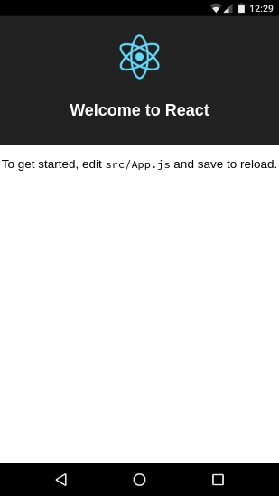
If everything installed properly, you shold see a screen like the one below showing the initial demo screen of create react app. We will use the phone device browser emulation in Chrome for easier reviews and debugging.
3. Create the styling of our container
We will begin creating the styles for our container component.
Our container will be a <div> with a firebrick red background
and white text spanning the full available width with some
padding. Create the file src/myContainer.css and add the
following style to the file.
1
2
3
4
5
6
div.MyContainer {
  width: "100%";
  background-color: firebrick;
  color: white;
  padding: 16px;
}
4. Create a basic container component using the above style
In src/myContainer.js create the following React container
component which is basically a <div> on which we apply the
styles we defined earlier. This container expects a title
which will be displayed with a <h1> tag separated from
the <div> containing other child components by a
horizontal ruler <hr>. Child components are added using
{this.props.children}.
1
2
3
4
5
6
7
8
9
10
11
12
13
14
15
16
import React from 'react'
import './myContainer.css'

export default class MyContainer extends React.Component{
    render(){
        return(
            <div className='MyContainer'>
                <h1>{this.props.title}</h1>
                <hr />
                <div>
                    {this.props.children}
                </div>
            </div>
        )
    }
}
5. Let’s test our container component
Let’s wipe out some of the Create React App boilerplate
in src/App.js and test our own component instead. We
need to first import MyContainer and use it. We will
pass a title and add two children - an image & a Lorem
Ipsum div.
1
2
3
4
5
6
7
8
9
10
11
12
13
14
15
16
17
18
19
20
21
22
23
import React, { Component } from 'react';
import logo from './logo.svg';
import './App.css';
import MyContainer from './myContainer'

class App extends Component {
  render() {
    return (
      <div className="App">
        <MyContainer title="Super Container!">
            <img style= src={logo} alt="logo" />
            <div>
                Lorem ipsum dolor sit amet, consectetur
                adipiscing elit, sed do eiusmod tempor
                incididunt ut labore et dolore magna aliqua.
            </div>
        </MyContainer>
      </div>
    );
  }
}

export default App;
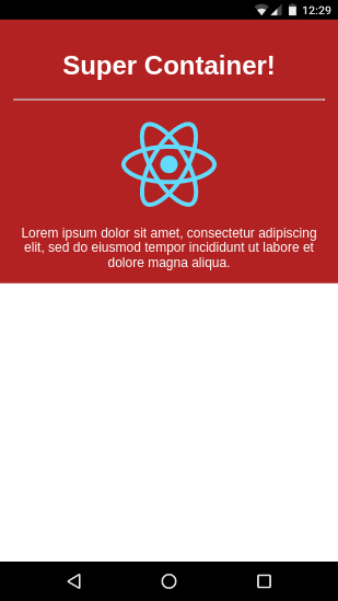
The outcome should look like the picture below with the red
card like container <div> taking up the full width available
but only as much height as required for the children plus
padding.
6. Adding Type Checking on Props
It’s good developmental practice to ensure the props we
want to consume have the type we expect. React provides
a PropTypes
mechanism to type check props during development.
This is stripped out in optimized production builds. Let’s
add type checking for string for the the title prop
in src/myContainer.js.
1
2
3
4
5
6
7
8
9
10
11
12
13
14
15
16
17
18
19
20
import React from 'react'
import './myContainer.css'

export default class MyContainer extends React.Component{
    static propTypes = {
        title: React.PropTypes.string
    }

    render(){
        return(
            <div className='MyContainer'>
                <h1>{this.props.title}</h1>
                <hr />
                <div>
                    {this.props.children}
                </div>
            </div>
        )
    }
}
7. Flexibility: Allowing DOM properties & event binding
Suppose the programmer consuming our custom component wanted
to let his users click on the container and capture the event.
They would try to bind to the onClick event on our container
like below in src/App.js. However, the expected console
message won’t show up if we do this.
1
2
3
4
5
6
7
8
9
10
11
12
13
14
15
16
17
18
19
20
21
22
23
24
25
26
import React, { Component } from 'react';
import logo from './logo.svg';
import './App.css';
import MyContainer from './myContainer'

class App extends Component {
  render() {
    return (
      <div className="App">
        <MyContainer
            title="Super Container!"
            onClick={e=>console.log("card clicked")}
        >
            <img style= src={logo} alt="logo" />
            <div>
                Lorem ipsum dolor sit amet, consectetur
                adipiscing elit, sed do eiusmod tempor
                incididunt ut labore et dolore magna aliqua.
            </div>
        </MyContainer>
      </div>
    );
  }
}

export default App;
This fails because the original creator of the container did not anticipate that a user will want to bind to the onClick event and did not provide for a way to do so. He merely wanted the component to be used as a container for other things.
However, as a container component developer, we can still
take advantage of ES6 semantics to provide a simple way to
pass on un-anticipated props and event bindings to the <div>
by the approach below in src/myContainer.js
Here, we use the experimental destructuring assignment
syntax to extract the props we are directly using in our
component (ie. title and children and bundle the
remaining properties and event bindings into {...other}
which gets passed on to the root <div> using the ...
spread operator.
Both the spread operator and the
destructuring assignment are supported in the Create
React App setup by default.
1
2
3
4
5
6
7
8
9
10
11
12
13
14
15
16
17
18
19
20
import React from 'react'
import './myContainer.css'

export default class MyContainer extends React.Component{
    static propTypes = {
        title: React.PropTypes.string
    }
    render(){
        const {title, children, ...other} = this.props
        return(
            <div className='MyContainer' {...other}>
                <h1>{title}</h1>
                <hr />
                <div>
                    {children}
                </div>
            </div>
        )
    }
}
On doing this, you will find that the onClick event is
firing and producing logging in the console. This is because
the onClick event binding has been passed on to the
root <div> of the component using the {...other}.
8: Flexibility: Allowing overriding style classes
Let’s say the user wants a dark green background instead of
the firebrick red background. Knowing how CSS3 works, he
notices that the container component is styled by a style
class named ‘MyContainer’. So he adds a style tied to
a more specific selector class in his src/App.css like
below.
1
2
3
div.MyContainer.greenbg{
    background-color: seagreen
}
He then uses it in src/App.js to try to override the
firebrick red background in MyContainer.
1
2
3
4
5
<MyContainer
    title="Super Container!"
    onClick={e=>console.log("card clicked")}
    className="greenbg"
>
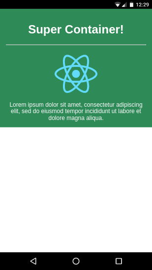
This unfortunately causes us to lose the background color entirely due to the overriding class not being handled correctly in our component.
To fix this, we need to handle the className prop in our
component and append it to any existing classes we are
already using. We will use the excellent classnames
module to do this - so first we need to install it.
1
npm install --save classnames
Now here below, we extract the className passed to us if any
using the destructuring assignment syntax and then append
it to the existing MyContainer class we use. This allows
the greenbg class to override only the background-color
property and not mess with other settings from MyContainer
like padding and text color white.
1
2
3
4
5
6
7
8
9
10
11
12
13
14
15
16
17
18
19
20
21
22
23
24
25
26
27
import React from 'react'
import './myContainer.css'
import classNames from 'classnames'

export default class MyContainer extends React.Component{
    static propTypes = {
        title: React.PropTypes.string
    }
    render(){
        const {title, children, className, ...other} = this.props

        const classnames = classNames(
            'MyContainer',
            className
        )

        return(
            <div className={classnames} {...other}>
                <h1>{title}</h1>
                <hr />
                <div>
                    {children}
                </div>
            </div>
        )
    }
}
This results in the correct background color being applied.
9: Flexibility: Adding a class to children
Sometimes, a container class needs to add styles and classes
to all its children. As a practical example, the Card Actions
section in Material Components for Web requires us to add
a class called mdc-card__action to all child buttons.
In our case, we will style all children of our component
to have their text left aligned. To do this, let’s first
go into src/myContainer.css and add the following style.
1
2
3
.childStyle{
    text-align: left
}
To apply this style to all the children, we need to first
iterate through the children. Due to the special nature of
the children props, we need to use the React.Children.map
function provided by React to iterate through them.
1
2
const newChildren = React.Children.map(this.props.children, child=>{
})
For each child, we need to first extract any existing classes
by accessing child.props.className. We then use our classNames
trick to add the our childStyle class and assign the combined
classes to a string.
1
2
3
4
const childclassnames = classNames(
    child.props.className,
    'childStyle'
)
Finally we clone the props of the child replacing the className
with our revised class string using Object.assign and then
clone the React component itself using the revised props. In
the component, we use the cloned children instead.
1
2
const newprops = Object.assign({},child.props,{className:childclassnames})
return React.cloneElement(child, newprops)
Here is the full revised code.
1
2
3
4
5
6
7
8
9
10
11
12
13
14
15
16
17
18
19
20
21
22
23
24
25
26
27
28
29
30
31
32
33
34
35
36
import React from 'react'
import './myContainer.css'
import classNames from 'classnames'

export default class MyContainer extends React.Component{
    static propTypes = {
        title: React.PropTypes.string
    }
    render(){
        const {title, children, className, ...other} = this.props

        const classnames = classNames(
            'MyContainer',
            className
        )

        const newChildren = React.Children.map(this.props.children, child=>{
            const childclassnames = classNames(
                child.props.className,
                'childStyle'
            )
            const newprops = Object.assign({},child.props,{className:childclassnames})
            return React.cloneElement(child, newprops)
        })

        return(
            <div className={classnames} {...other}>
                <h1>{title}</h1>
                <hr />
                <div>
                    {newChildren}
                </div>
            </div>
        )
    }
}
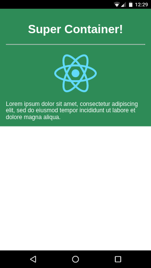
This should result in children text being left aligned.
Conclusion
I hope this article is useful in outlining some of the best practices required for creating flexible and modular React components. Please do shout out case of any errors, comments or suggestions.